For many indigenous languages, diacritics or accent marks are an important part of the orthography. Diacritics can appear above, below, or beside base letters, and in some cases, above or below other accent marks. To display properly on-screen or printed out, the font you are using must have built-in instructions telling the computer where the accent marks should be. There are two ways which a computer builds an accented character:
- Precomposed characters include a base letter and accent mark in the same character. Unicode only includes precomposed characters for the major European and Asian languages.
- Combining diacritics are a group of Unicode characters which include the accent mark only—there is no base character. The combining diacritic merges with the preceding character to build the correct accented letter. Many North American, South American, African, and Austonesian languages have accented letters which computers treat as combinations of base character and combining diacritic.
It is important to understand that these two methods to type accented characters are not in any theoretical hierarchy: French isn’t inherently better because it can be typed with precomposed characters while Diné Bizaad (Navajo) cannot.
Working with Precomposed Characters
The existence of the precomposed characters is due to backwards compatibility with old character sets. That is, the old fonts were not sophisticated enough to combine diacritics properly, therefore they needed to contain à, é, î and so on as separate characters. And as so many pre-Unicode documents already existed in those old fonts, Unicode had to include those precomposed characters in their new system. In any up-to-date computer software, those French accented letters can just as easily be typed with combining diacritics: à, é, î.
In some cases, the accents needed for the Native language are the same as those used in major European languages. The Hinóno’eitíít (Arapaho) language uses only the acute accent, which also occurs in Spanish and Portuguese. Thus Hinóno’eitíít can be typed with precomposed characters without any display problems on your computer.
Want to know more?
Languagegeek’s Typography section has more details about accents and Native languages.
The Quick Fix
If accent marks are not where they should be, download and install either Aboriginal Sans or Aboriginal Serif. These fonts were designed to put the accent marks where they belong
Working with Combining Diacritics
Theoretically, combining diacritics should work just as well as precomposed characters. In reality, this is not always the case. The latest versions of all major operating systems: Mac, Windows, and Linux can all handle combining diacritics. Certain older software packages have problems, but generally speaking, your computer can manage.
The problem lies with the system fonts which come pre-installed on your computer. These, in many cases, cannot manage combining diacritics. There are several possibilities:
- The font simply does not include the combining diacritic characters. See Figure 1. Minion in inDesign.
- The font does not have complete OpenType commands which tell the computer where the accents should go. Often some of the accents will look fine while others are completely wrong. See Figure 2. Helvetica on Mac OS X.
- The default font spacing does not accomodate diacritics which are either very high or low. In most situations this is relatively easy to fix: increase the line spacing. However, it is not obvious to most people how to increase line spacing on someone else’s web page (you’ll have to make custom CSSs). See Figure 3. Arial on Vista.
The solution to all these problems is to view the Native-language text with a font like those available from Languagegeek. Once you have downloaded and installed Aboriginal Sans and / or Aboriginal Serif—and set your software to use these fonts—all the accents will be where they belong and will not be blocked out by the default line spacing (See Figure 4. Aboriginal fonts on Mac)
Figure 1. Minion in inDesign
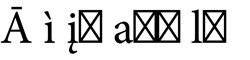
The lack of combining diacritics in the font results in empty boxes.
Figure 2. Helvetica on Mac OS X
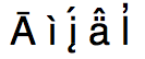
Incomplete OpenType commands result in a malformed į-acute; the dot should have disappeared.
Figure 3. Arial on Vista
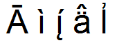
The apostrophe acccent on top of the lowercase-l is cut off.
Figure 4. Aboriginal fonts on Mac
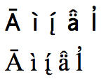
In Aboriginal Sans and Aboriginal Serif, the accents are placed correctly
