Pitabek |
|
Pitabek is based on the original French Catholic missionary font first used in the Fort Albany Cree “Catechisme, Recueil de Prières et de Cantiques...” in 1854. This first book was published by the Imprimerie de Louis Perrault, and was typeset by Joseph Guibord (a rather interesting person in Canadian history). By around 1900, this typeface was supplanted by a similar font (which will be made available on languagegeek in the future). The font’s name, “Pitabek” comes from the Cree word for Fort Albany. This font belongs to what I have called the kā-ayisawēyaki style. This style is most notable for its tall n- and l-series, mid-line finals, a round period, and large character widths. As best as I can tell, the original typeface never contained long vowel dots or western Cree ‘r’ and ‘l’ syllabics. I have added these characters to meet the needs of the modern languages. Generally speaking, the missionary books of the 1800’s and early 1900’s used a “modern” (didone) Latin font for French or English words to go along with the syllabics. Not an obvious pairing, but the two together certainly give an atmosphere to a document.
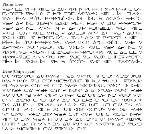
Plains Cree from Sarah Whitecalf in Wolfart and Ahenakew. Chipewyan from Li and Scollon. I have transliterated the Chipewyan into syllabics from the original linguistic orthography. |
OpenType features
|