|
Morice is a rendition of an 1800’s font in a modern electronic format. The Morice font is named after the designer of the Dakelh syllabic system, Adrien-Gabriel Morice (1859-1938). This font was specifically taken from his work, The new methodical, easy and complete Dene syllabary. This font is interesting in that it has unusual directions for the n-, m-, y-, j-, and ch’ series for the vowels u, e, and i. This orientation may be preferable for some speakers or dialects. There are several aspects which make this font specially suited for the Dakelh (Carrier-Dene) language.
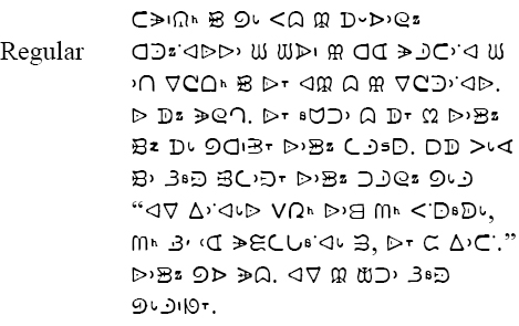
The Morice font lends a very traditional, old- fashioned look to Dakelh texts. However, this font is based on a small-size version of the old type, and because of the nature of type, this font will show some irregularities at very large sizes. Yet it is these irregularities which give the font its personality. |