 |
Kayases |
|
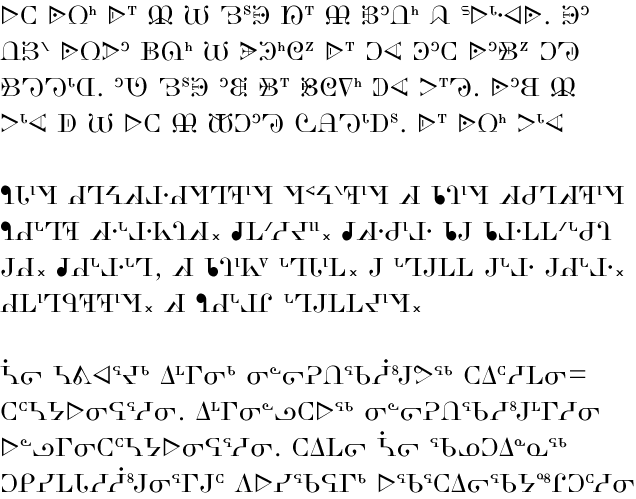
The word kayases is Cree for ‘a little while ago’. The font itself is based on the modern-style typefaces of the Victorian era; the same period in history which marks the first printed material in syllabics. In bilingual books of the time, a fancy, modern Latin typeface accompanied a dark syllabics font (like languagegeek’s Pitabek). This led me to wonder what would syllabics look like in the popular style of its Roman contemporary. The result is the Kayases font. It is a high-contrast font, with large differences in line thickness between horizontal and vertical strokes. The serifs are also quite pronounced. This makes Kayases a somewhat dazzling font at small sizes; it is more majestic when larger. The effect, I think, works especially well for Dakelh (Carrier) and Blackfoot. In the former, the curls and twists of the orthography give text a very victorian look. This PDF file shows further examples of Kayases in various languages and font sizes. |
